
Executive summary
- A decade of earnings, one number. The Shiller CAPE (cyclically-adjusted price/earnings) divides today’s price by the average of ten years of inflation-adjusted earnings. Averaging a full cycle strips out the one-quarter booms and busts that make an ordinary P/E swing, leaving a single figure that reads as long-run valuation.
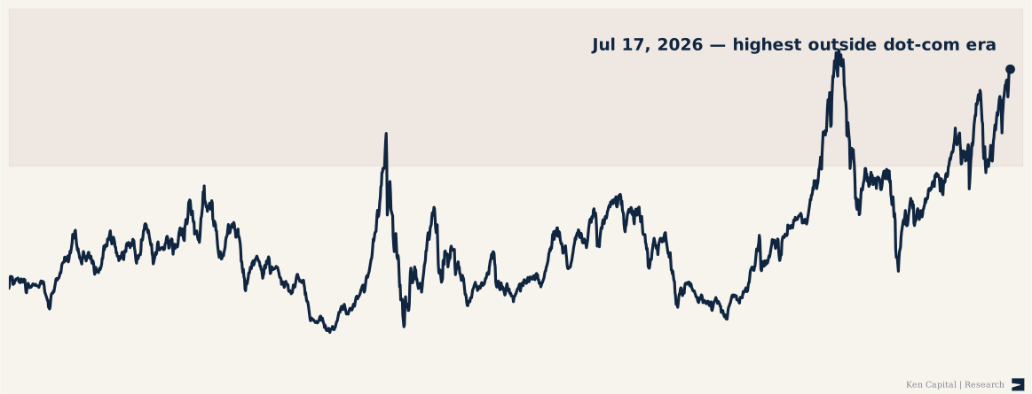
- The dated snapshot was near a record. On July 17, 2026, at about 41.5, the CAPE stood above the 2021 pandemic-era peak (~39) and at its highest level outside the 1999–2000 dot-com era, whose monthly readings reached about 44 — roughly 2.4× the long-run mean of ~17.
- A map, not a timing tool. A high CAPE has historically foreshadowed weak long-run returns; it says little about the next month or quarter. This is terrain to be aware of, not a sell signal.
What the CAPE measures
An ordinary price/earnings ratio divides price by a single year of earnings, so it lurches around with the profit cycle — it can look “cheap” at the top of a boom, when earnings are temporarily high, and “expensive” at the bottom of a bust. Robert Shiller’s fix is to divide price by the average of the prior ten years of earnings, adjusted for inflation. That decade-long average smooths the extremes, which is what makes the CAPE useful over long horizons: it compares price against a normalized measure of what the market actually earns.

Where we are, against where we’ve been
The chart is the whole argument. Across 155 years the CAPE has spent most of its life between roughly 10 and 25, averaging about 17. It has pushed above 30 only in a handful of eras: the run-up to 1929 (~33), a brief stretch in early 2018 (~33), the dot-com mania that topped at ~44 in December 1999, and the post-pandemic era from 2020 on.
The July 17, 2026 reading of ~41.5 belongs to that last era. Every higher monthly observation in the shipped series falls inside the 1999–2000 dot-com era, which peaked near 44; the snapshot also stood above the ~39 post-pandemic peak of late 2021. That is the comparison worth sitting with: at that dated observation, the market was priced richer than it had been at the 2021 peak and within a few points of the most expensive era in the record.
The short-term companion
Valuation is the long lens. The short one — what momentum is doing right now — is a separate note: SPY, September 2024 — a higher high on weaker momentum. Read together, they frame the same caution on two clocks: valuation says the setup is stretched for years; momentum says the tape can be fragile in weeks. Neither is a timing signal on its own.
Method and caveats
The series is the published Shiller CAPE (Robert Shiller’s data, via multpl), monthly through June 2026 with the final July 17 snapshot, and shipped above as a CSV. The single most important caveat: the CAPE is a poor short-term timer. It has stayed elevated for years at a stretch — a high reading in the mid-1990s was “expensive,” and the market roughly doubled before it broke. It is also not a fixed yardstick: accounting changes, persistently low interest rates, and the shift toward buybacks have all been argued to justify a higher “normal” CAPE than the 20th-century average. Treat the dated level as context, not a verdict.